Client & Project Type
Nawy Real Estate | Real-estate | mobile app
Overview
Nawy Real Estate was an emerging platform aiming to revolutionize the real estate industry through innovative technological solutions in 2021. They had built parts of their data and website before approaching us. Our team was to develop a Minimum Viable Product (MVP) that would serve as a user-friendly platform where individuals could browse, filter, and connect with real estate properties via multiple communication channels, such as phone and WhatsApp.
In a highly competitive market, Nawy seeks to offer property seekers a simple, stress-free experience. The MVP served as the kickstart for their platform, aiming to disrupt the traditional real estate market by leveraging technology to enhance user experience.
Project date: April 2021
Design files: Wireframes
My Role
UX/UI Designer
Responsibilities
1. Conducted comprehensive user research and competitive landscape evaluation.
2. Developed wireframes and high-fidelity prototypes.
3. worked closely with stakeholders and the development team to ensure successful implementation.
4. Crafted the entire user experience and interface for the MVP.
2. Developed wireframes and high-fidelity prototypes.
3. worked closely with stakeholders and the development team to ensure successful implementation.
4. Crafted the entire user experience and interface for the MVP.
Team Collaboration
I was part of a three-member UX team, collaborating closely with:
Together, we led the research and ideation phases, and I took ownership of delivering the final design and prototype.
The Challenge
In their early stages, Nawy required an MVP to launch its platform that enhances user experience by simplifying real estate browsing and transactions. The primary challenge was to design an intuitive interface that catered to both property seekers and owners while laying the groundwork for scalability in future iterations.
Target Audience
Property Seekers: Individuals searching for properties to buy or rent, who want an efficient and hassle-free search experience.
Property Owners: Individuals or developers looking to list their properties for sale and monitor their market performance, requiring ease of access and transparency.
Property Owners: Individuals or developers looking to list their properties for sale and monitor their market performance, requiring ease of access and transparency.
Project Goals
1. Develop an intuitive search with detailed filters.
2. Provide detailed property listings, including detailed specifications and high-quality photos.
3. Offer transparent pricing with flexible payment and instalment options.
4. Enable side-by-side property comparisons to assist decision-making.
5. Integrate communication options like phone, text, and WhatsApp.
6. Facilitate online property viewing bookings and management.
7. Provide direct access to dedicated agents for personalized support.
8. Implement a referral system for customers to encourage engagement and increase sales.
9. Showcase current promotions and offers from verified developers.
The platform needed to address the users' pain points while also supporting Nawy's business goal of becoming the number one real estate solution provider in the region.
App definition breakdown
The Design Process
Research and Discovery
Our team sat together and decided our research would focus on two main objectives:
1. Understanding the needs of the key users of the app (Property buyers and owners).
2. Identifying the competitive landscape by studying similar apps and services.
2. Identifying the competitive landscape by studying similar apps and services.
Key Users
Starting with the users, we identified key pain points and user needs for both property buyers and owners
Property Buyers
Goals
● Finding suitable properties for personal, professional, or investment purposes.
Pain points and needs
1. Need easy access to updated lists of properties for sale in their desired areas with comprehensive details about the properties and their surrounding areas.
2. Need clear knowledge of prices and payment plans to adjust their budget.
3. Desire the ability to schedule property viewings that fit their time.
4. Need assistance in navigating the real estate market with trust.
2. Need clear knowledge of prices and payment plans to adjust their budget.
3. Desire the ability to schedule property viewings that fit their time.
4. Need assistance in navigating the real estate market with trust.
Property Owners
Goals
1. Follow the state of their properties in the market in terms of price trends and surrounding facilities.
2. Sell their properties for a fair price easily and safely.
2. Sell their properties for a fair price easily and safely.
Pain points and needs
1. Need guidance on how to value their properties properly according to the current market.
2. Need an easy way to market their properties for selling and reach potential buyers.
3. Need help showing their properties without wasting time or effort.
2. Need an easy way to market their properties for selling and reach potential buyers.
3. Need help showing their properties without wasting time or effort.
Competitive Landscape
As for the competition, we selected a few companies with mobile apps and/or websites that provide similar services in Egypt and abroad:
1. Property Finder (Egypt)
2. Aqarmap (Egypt)
2. Property Inventory Enterprise (PIE) (Egypt)
3. Zillow (The US)
4. Redfin (The US and Canada)
5. ImmoScout24 (Germany)
2. Aqarmap (Egypt)
2. Property Inventory Enterprise (PIE) (Egypt)
3. Zillow (The US)
4. Redfin (The US and Canada)
5. ImmoScout24 (Germany)
We studied these apps/websites to understand their offerings and focus on our strength points, especially in the Egyptian market. We analyzed the applications in terms of usability, services, accessibility, and offerings and identified opportunities for our app to excel.
Analysis and Planning
After completing our research, we laid out the information architecture and identified the key entities within the system. We started brainstorming sessions to lay out the basis for our project. We started by visualizing the relationships between these entities in the following diagram, mapping out how each user would interact with the app’s core features.
Entity relationship diagram for all the entities interacting with Nawy's system.
Visually mapping out the relationships between key users and system components helped our team define the core entities—such as property buyers, owners, developers, agents, and properties—along with their data and interactions within the app. This allowed us to move forward with building the foundation of the user flows, setting the stage for constructing the app’s basic structure.
Wireframing
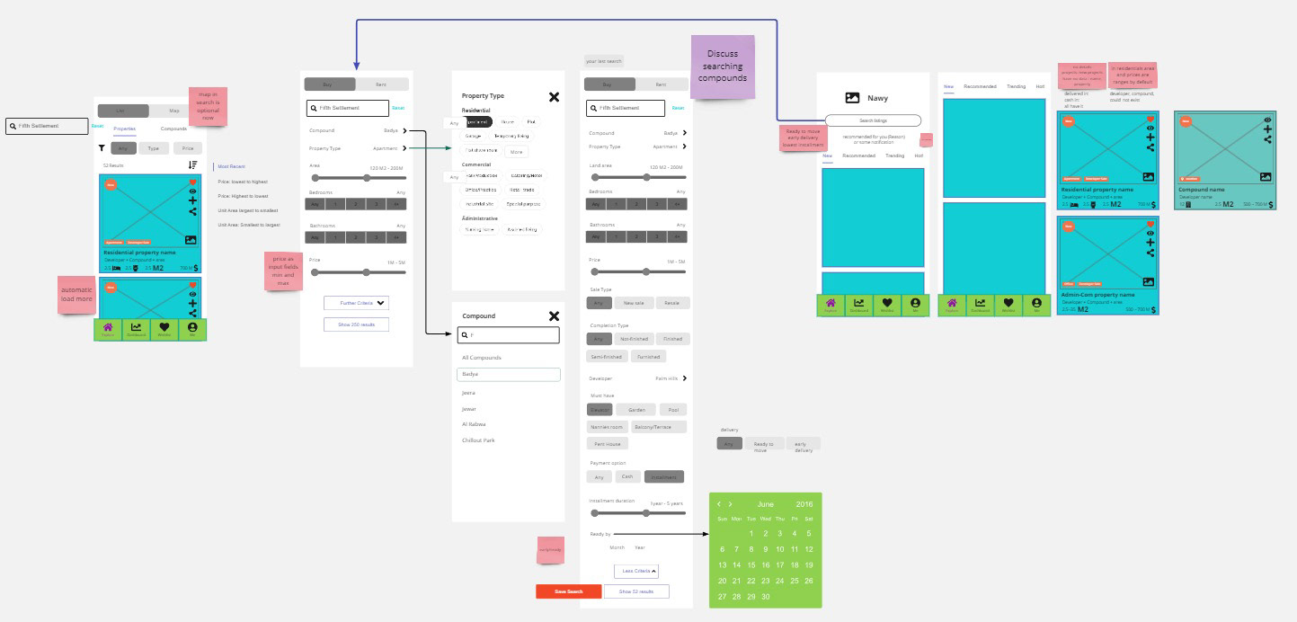
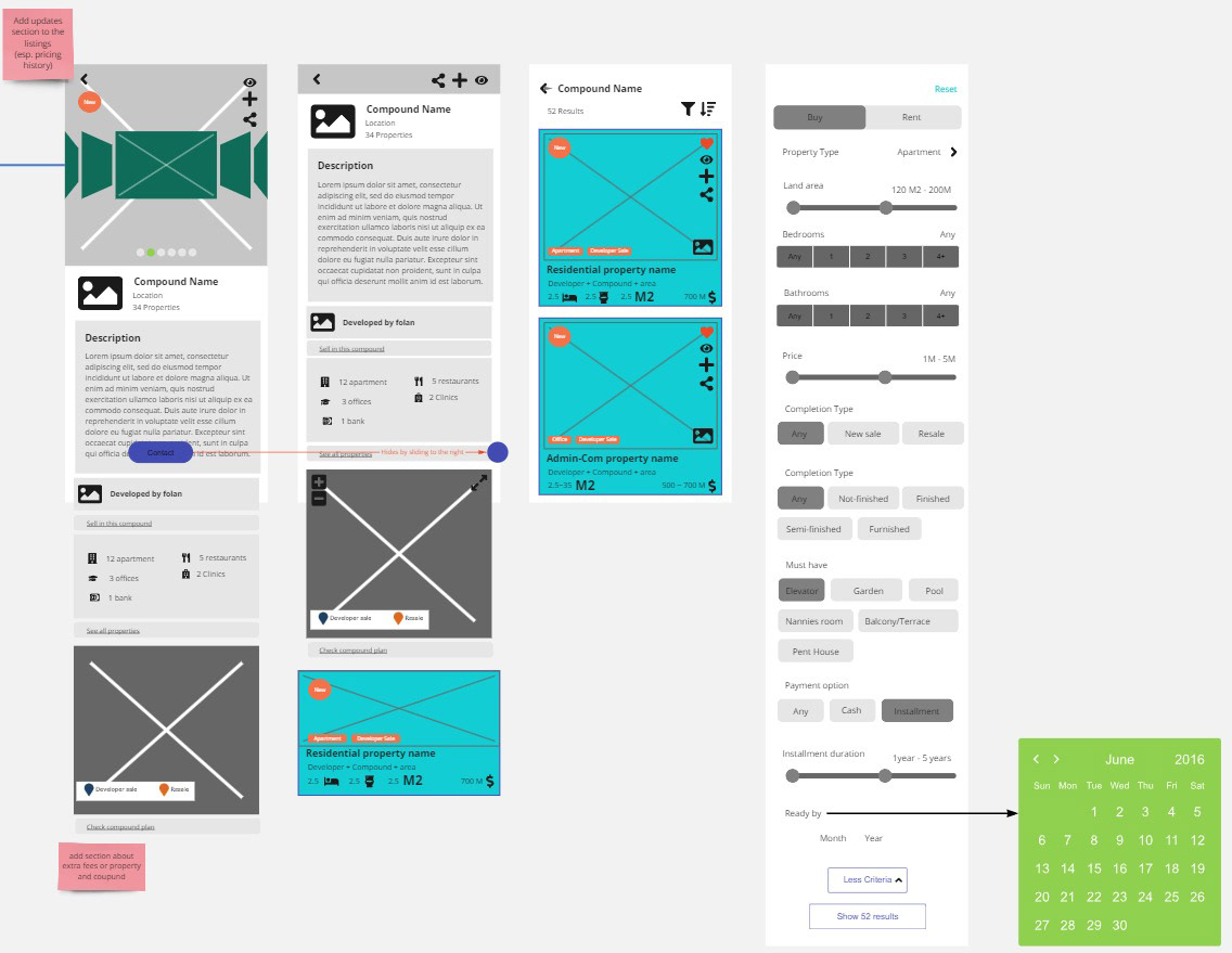
We started developing low-fidelity wireframes to map out the main user flows. We prioritized the search/explore feature as the primary entry point for users in this iteration of the app. Initially, the navigation included a dashboard to manage properties sold/owned, a wishlist to keep track of properties in the market, and a profile (Me) page that would be the entry point to contacting agents for support or updates and other secondary functionalities in the app.
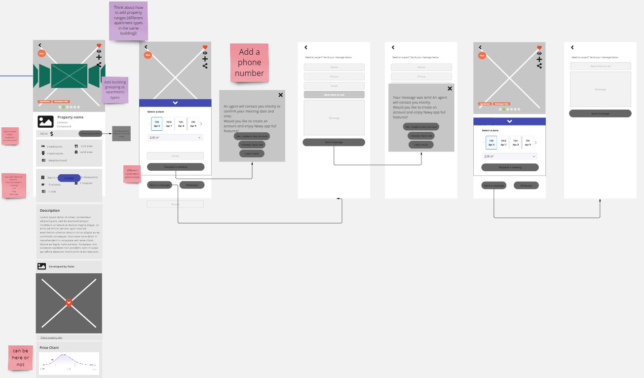
In this version, we explored several advanced features, including a map-based search to compare properties, display key details about each property (such as area/compound information and developer details), schedule property showings, and assign agents for direct communication. Users could also mark properties for a watchlist, which influenced their update feed, and save properties to a wishlist for easy reference.
After several rounds of iteration with the client and adjustments based on available data, we decided to simplify some of these features to better align with the MVP's focus. The final version of the wireframe, which we moved into prototyping, included the following core features:
1. Search/Explore functionality with detailed filters for both properties and compounds.
2. Property and compound comparison to allow users to easily evaluate multiple properties or compounds side by side.
3. Direct sales/agent contact for every property and compound for easier interactions.
4. Direct access to an assigned agent for each user, providing personalized assistance and guidance through buying and selling properties.
5. Booking property showings directly from the compound and property pages.
4. Payment plans from every developer for relevant compounds and properties, giving the user transparency when it comes to finances.
5. Marking compounds and properties as favorites for easy access later.
6. General updates and advertisements from different developers to keep the user informed about promotions and new listings.
7. Payment reminders for sales through Nawy.
8. Listing user property for sale to help the user sell their properties more easily through our agents.
9. A referral system where current customers can be led to new ones for Nawy to contact.
Prototyping
I transitioned to building the high-fidelity prototype using Figma after settling the plan and features with the client. My focus was to create a high-quality, visually appealing, and intuitive user experience that aligned with Nawy's view for their MVP. I developed the prototype in iterative phases, continuously updating the client and keeping the feedback loop active to ensure alignment at every stage.
One of the main challenges I encountered was a shift in the client’s vision later in the prototyping stage. For example, the client requested changes to the color scheme and layout to match updated branding guidelines, as Nawy’s branding changed during this phase (this included changes to the logo and business name as well). Despite these late-stage changes, I was able to incorporate the adjustments while maintaining a smooth and intuitive user experience within the requested timeframe.
During this phase, I focused on:
1. throughout the app to ensure visual consistency. I chose Google Material Design for the design system as it worked well with Flutter, making the development process smoother and optimizing the app for both iOS and Android.
2. Conducting mini user testing sessions from different age groups, with participants from different age groups, gathering feedback on ease of navigation and the visibility of important features.
3. Working closely with the client throughout the process, adapting to their evolving vision while ensuring the project remained on course and within the given time frame.
The following are sample frames from the actual app design:
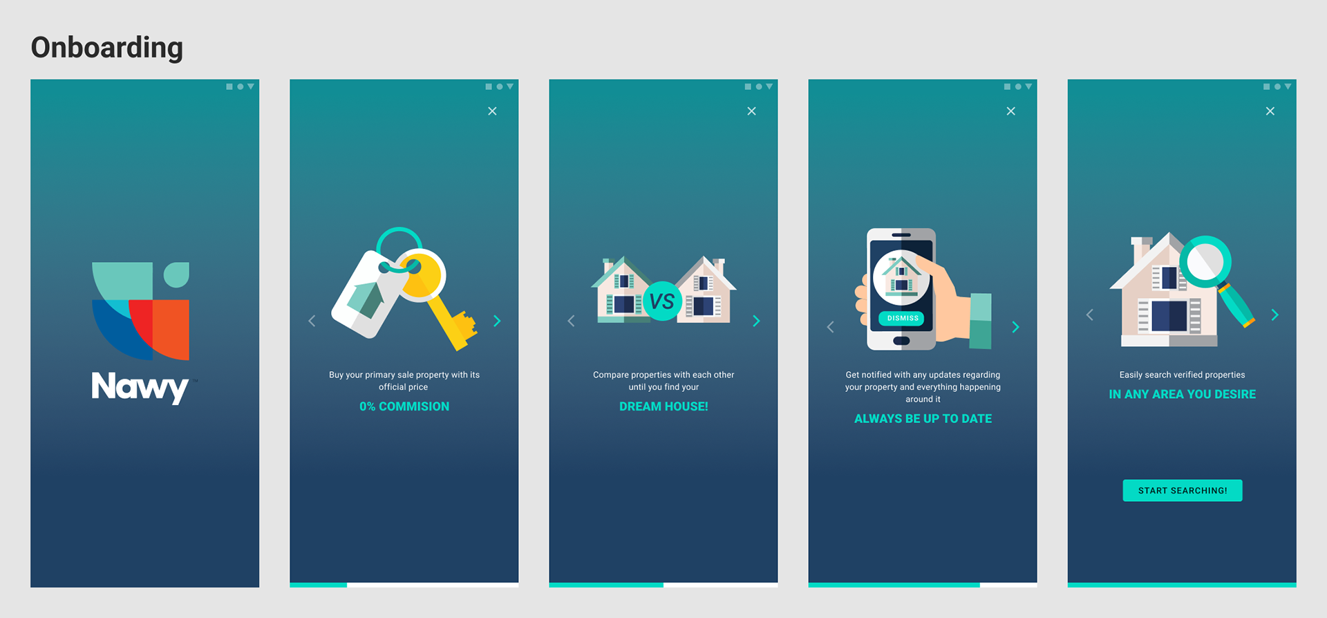
Onboarding sans login/signup
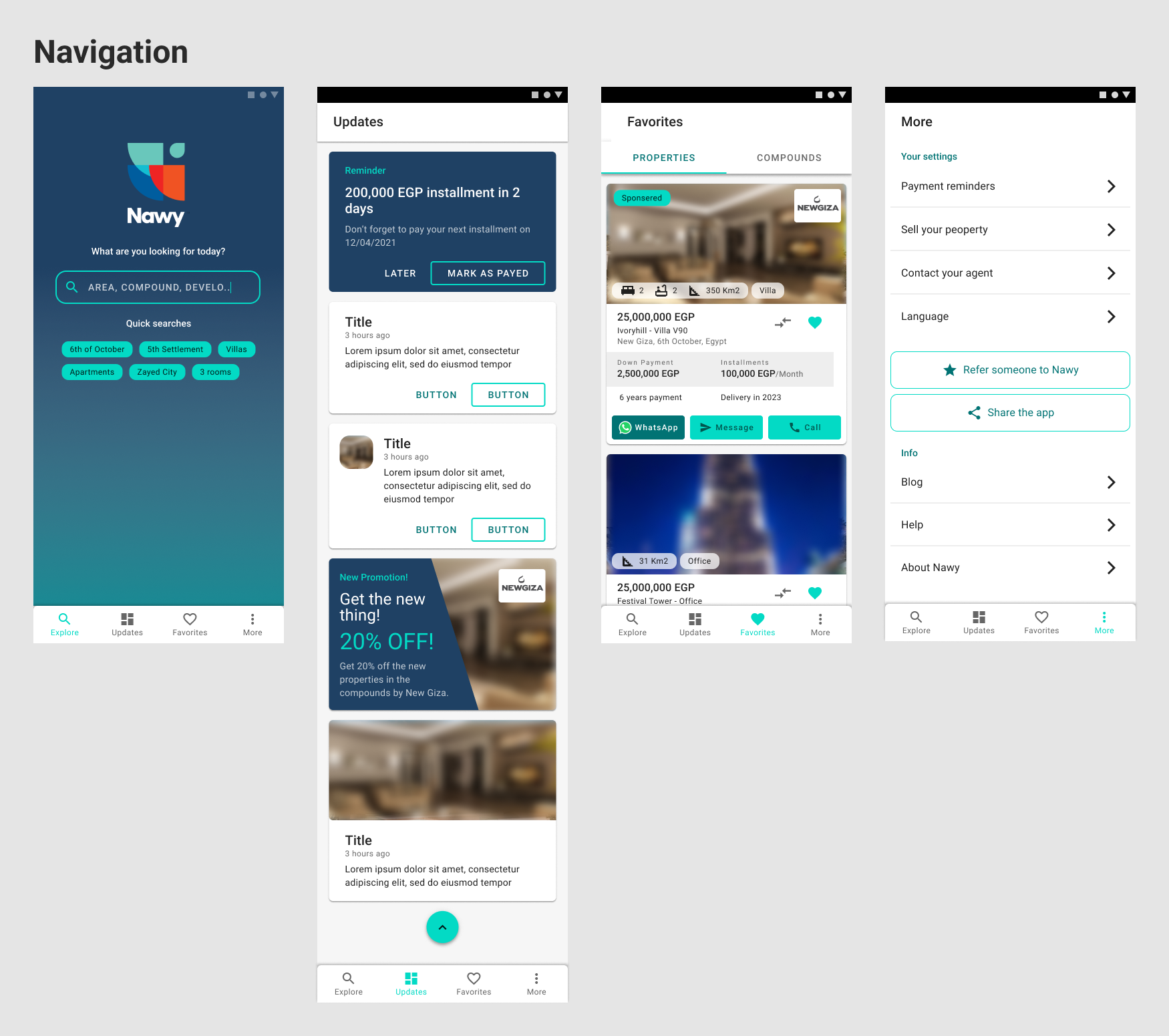
Navigation
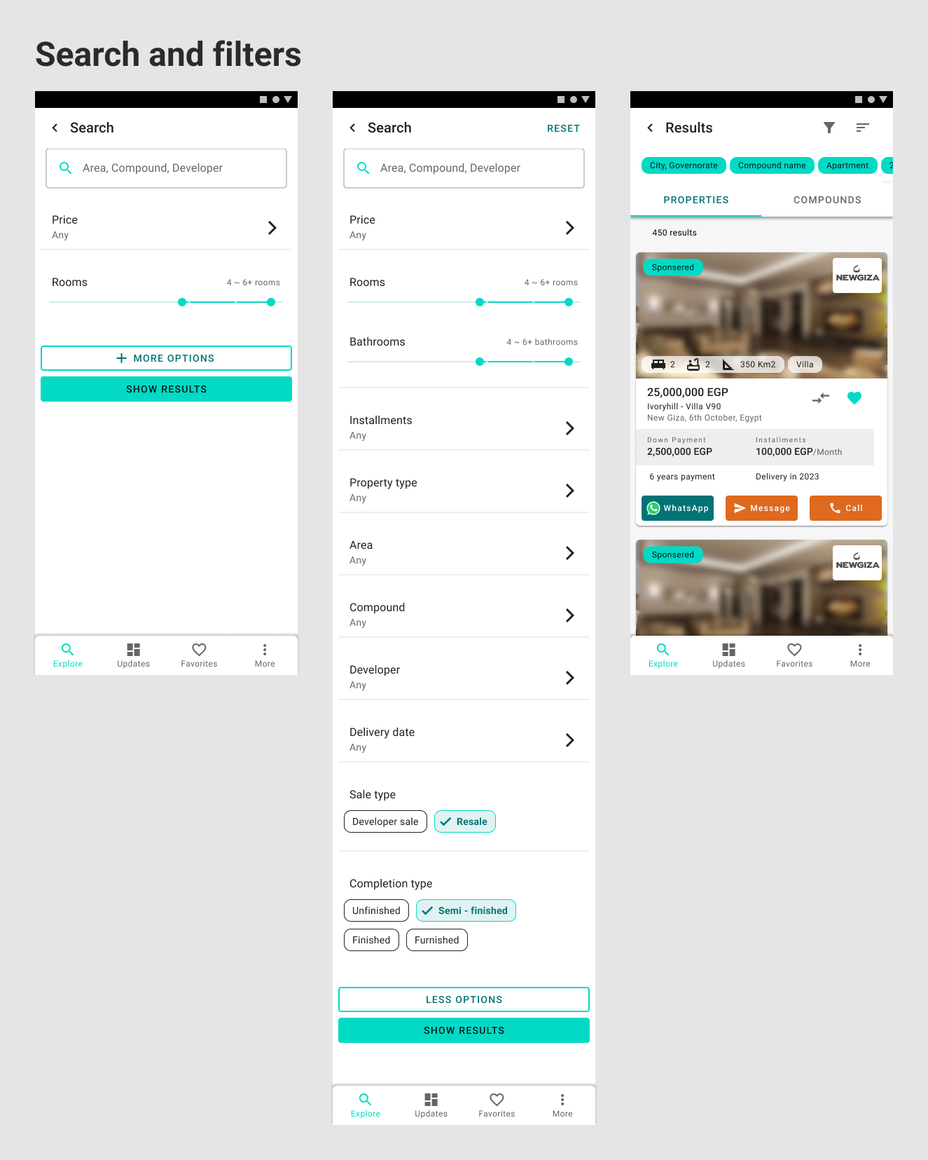
Search and filter
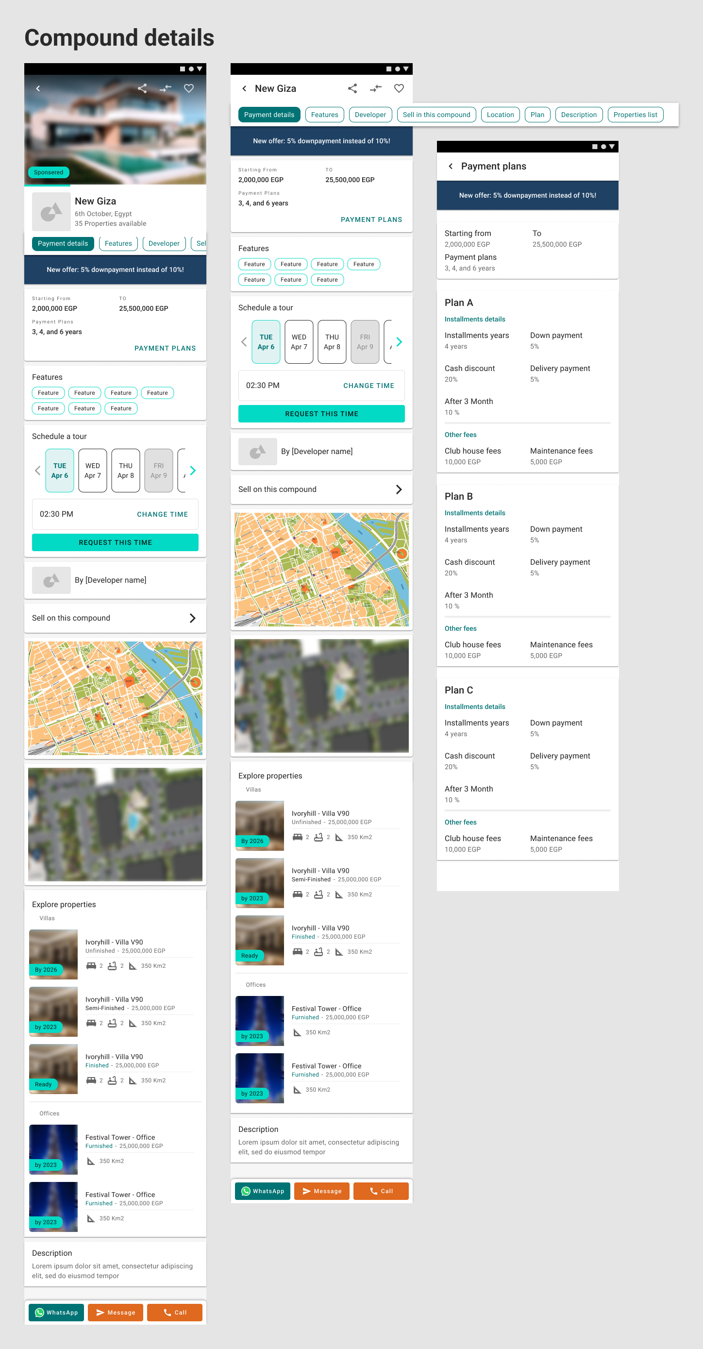
Compound detials
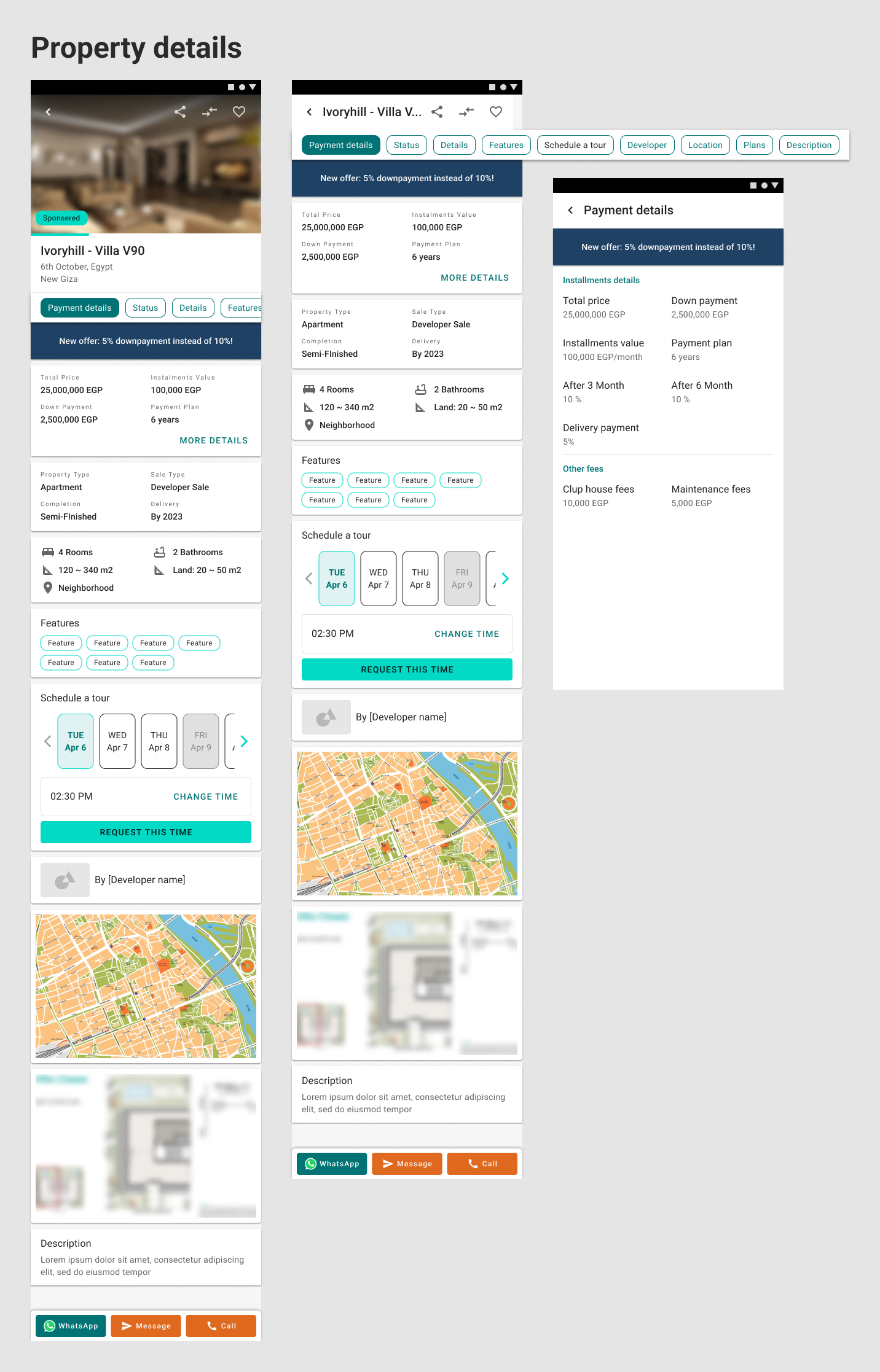
Property details
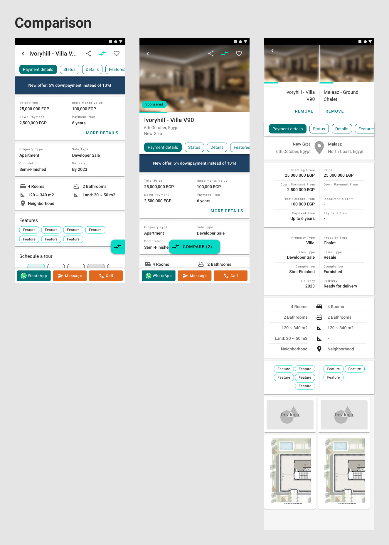
Comparison
Delivery and Conclusion
By the end of the design process, we delivered high-fidelity wireframes with user flows and a complete set of components on Figma, along with the documentation of our research on Miro that explained the entire process. Despite the challenges we faced—such as late-stage branding changes and adjustments to the feature set—we successfully delivered a mature product that provided Nawy with a strong foundation for its launch and positioned it for future growth. After delivery, I worked closely with the development team to review the end results and fix any issues that they encountered in the implementation phase.
This was my first product design project where I led the effort, albeit under the supervision of my seniors, and it was an incredibly valuable learning experience. It helped shape my mindset and deepened my understanding of the product design process, particularly in balancing user needs with business objectives. The project also taught me the importance of flexibility and client collaboration in adapting to changing requirements while maintaining the overall design vision.
Overall, the project was a rewarding experience that laid the groundwork for Nawy's success, and I’m proud of the role I played in delivering a solution that aligned with both user needs and business goals.
