Ophois Studios was an indie art studio dedicated to developing diverse art forms and offering education to creatives in the Egyptian market through various workshops.
The studio operates two main sub-brands: Ophois Art Academy and Ophois Comics.
First: Ophois Art Academy
Ophois Art Academy offers alternative art education guided by professionals from the art industry. Although it started as a sub-brand under Ophois Studios, the Academy has maintained its own independent identity to keep its projects and marketing distinct. This separation allows it to focus on its unique offerings while still being closely connected to the larger vision of Ophois Studios.
Logo:
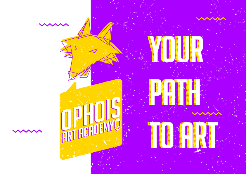
The logo took an abstract spin on the main brand’s logo design. This abstract interpretation was chosen to reflect the brand’s focus on education, symbolizing the foundational lines and forms that creators learn to use as they break down and understand the world around them. The scratchy texture was intentionally designed to represent the trial-and-error nature of learning, evoking a sense of experimentation and the hands-on, workshop atmosphere central to the brand’s philosophy. The logo, with its raw and unpolished aesthetic, captured the essence of creativity in progress. The use of vibrant purple and yellow as the alternating main colors for the brand was to add a bold, eye-catching edge. These colors were selected not only for their ability to stand out in various environments and surfaces but also for their stimulating effect on the brain. Purple, often associated with creativity and innovation, paired with yellow, a color linked to energy and optimism.
Social media posts:
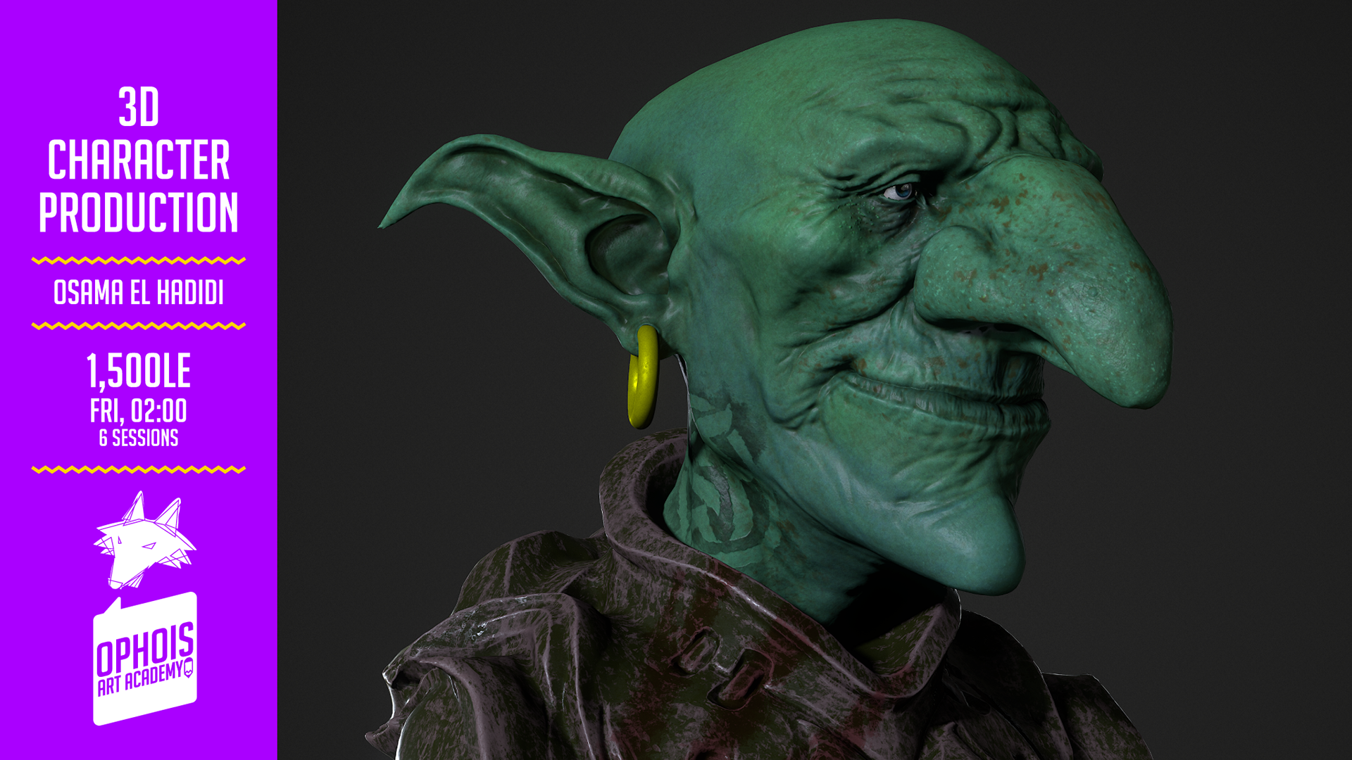
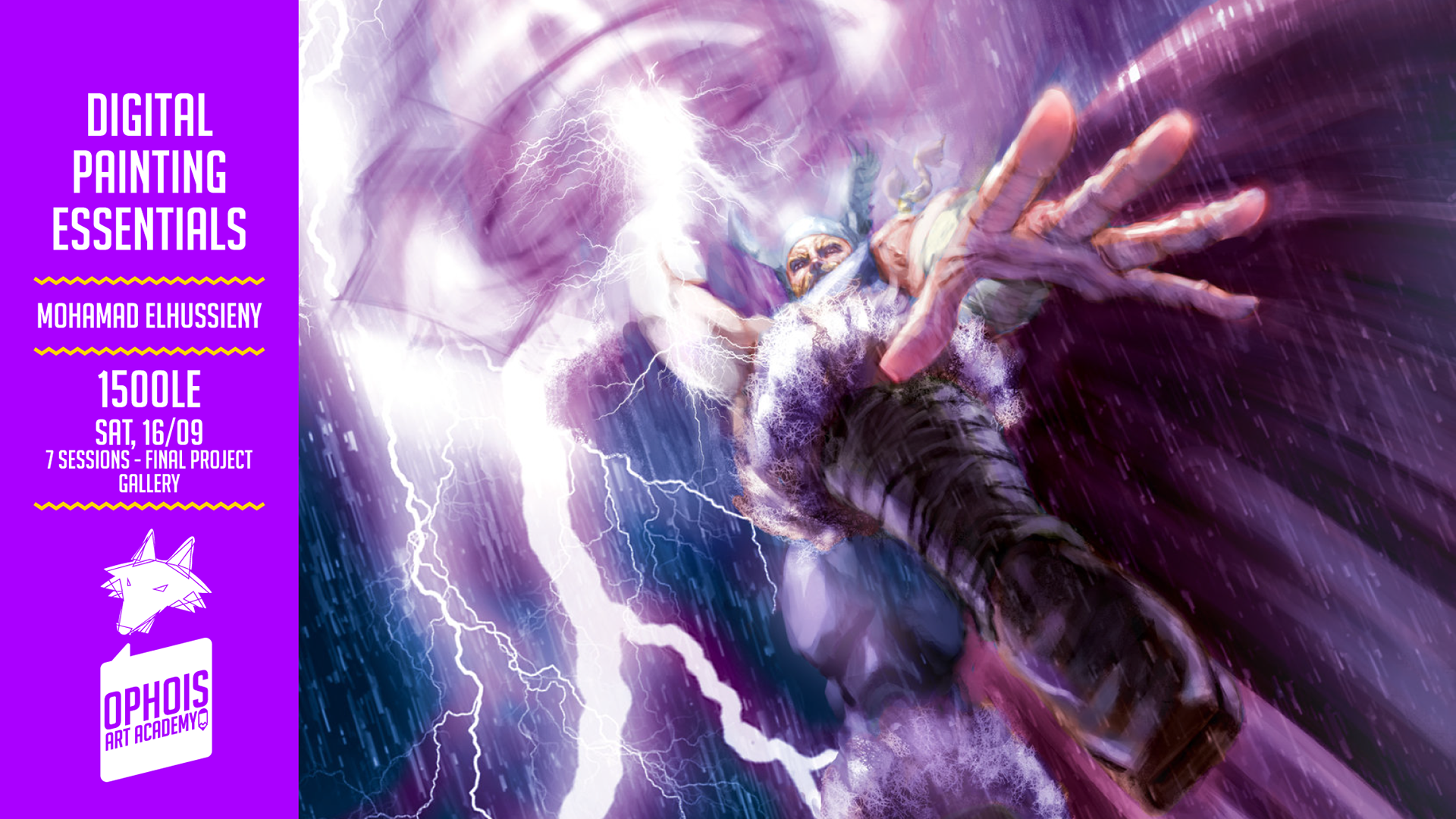
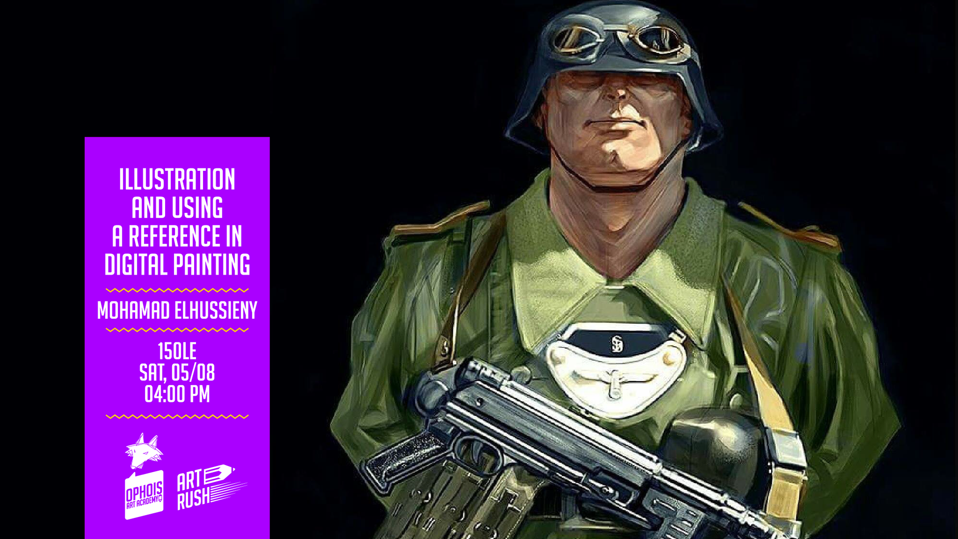
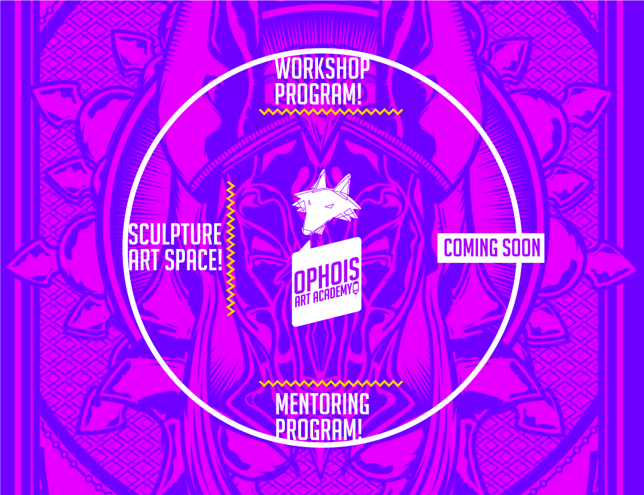
The brand's main product was courses, which were mainly promoted online through the studio's main page.





Second: Ophois Comics
Ophois Comics served as the publishing arm of Ophois Studios, specializing in the editing, production, and distribution of comic books. As an independent sub-brand focused on comics, it played a key role in bringing diverse, creative narratives to life. With several indie comic titles published, including Al Omara and Ponytail, Ophois Comics became known for its distinctive storytelling and unique art styles. Acting as the publishing hand of Ophois Studios, it not only produced original works but also ensured they reached their audience, establishing a presence in both local and international comic book markets.
Logo:
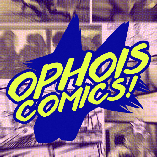
The logo was adapted from the main brand's design, featuring Ophois's head rendered in a more detailed, illustrated style. This detailed head was then transformed into a silhouette, mimicking visual effects commonly used in comic books. The brand name was placed above the head in a typeface reminiscent of comic book lettering.
Business cards:
Employees using business cards had the option to choose between two distinct colors: blue or pink. Both designs featured yellow text, creating a combination that resembled printing ink colors (as in CMYK), but with hues closer to the brand's unique color palette. This playful yet professional color scheme helped reinforce the brand’s creative identity, while also providing employees with a degree of personalization in their business cards.
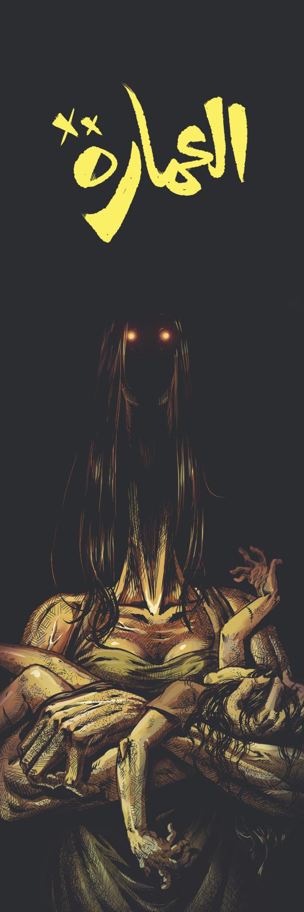
Bookmarks:




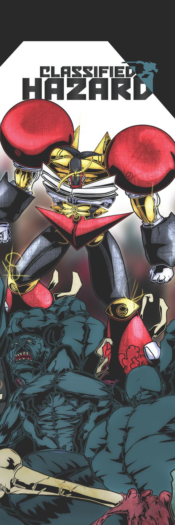


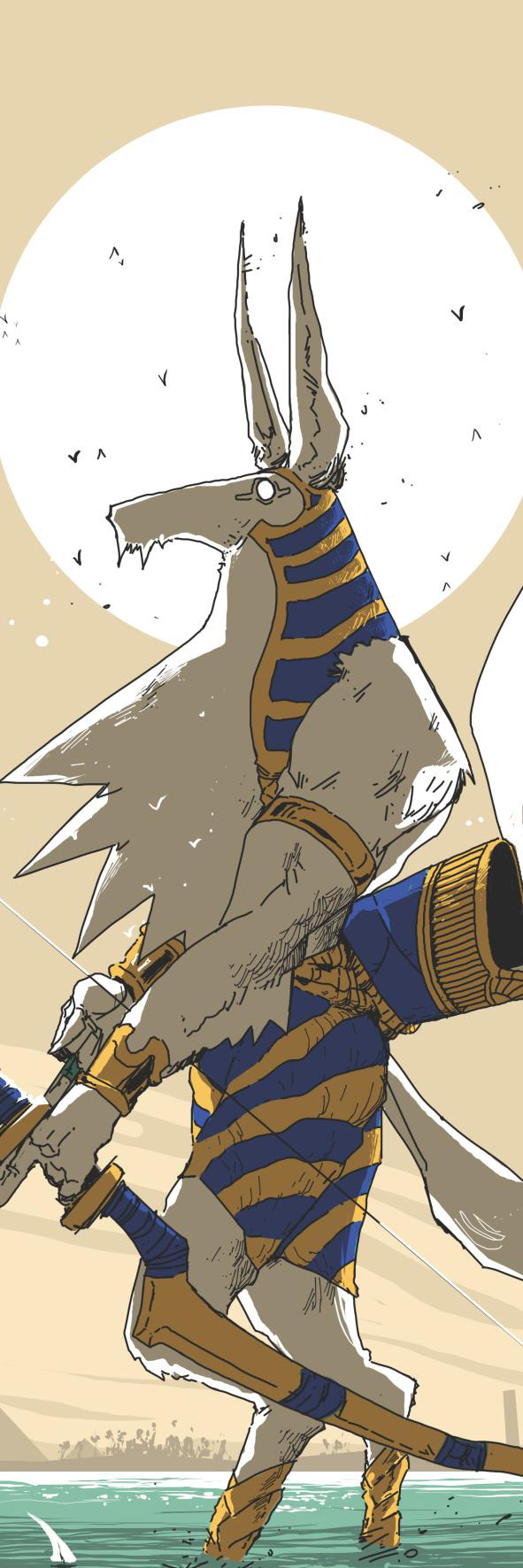




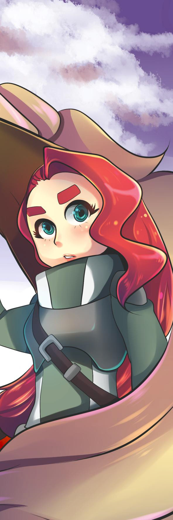

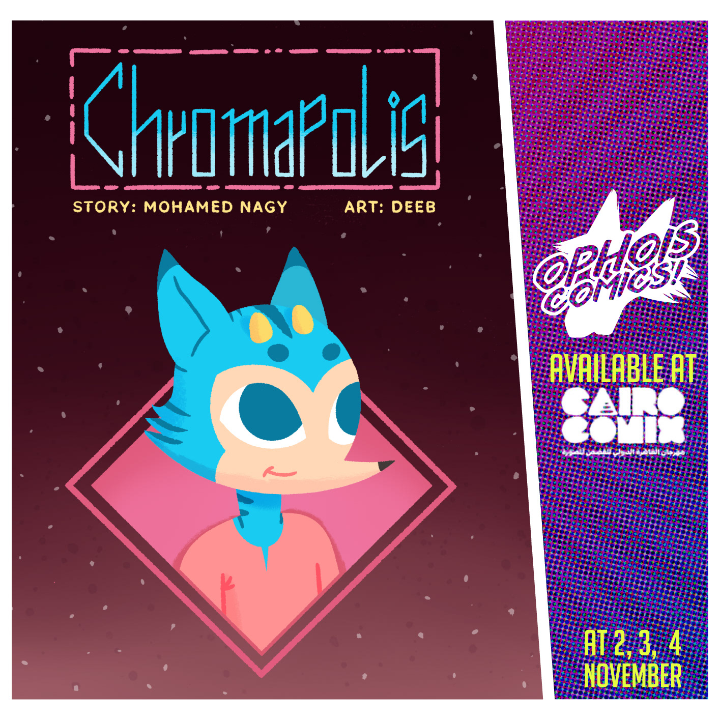
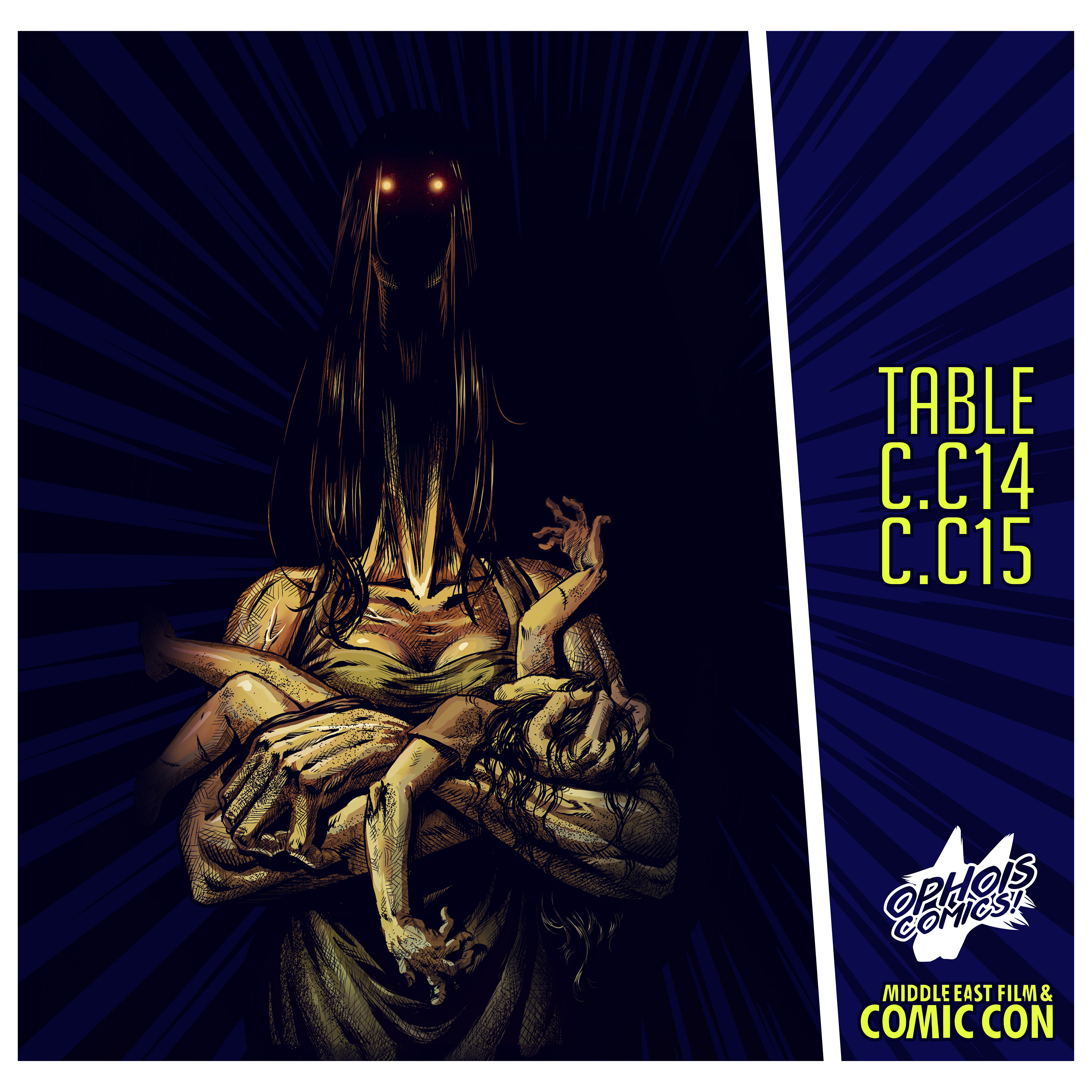
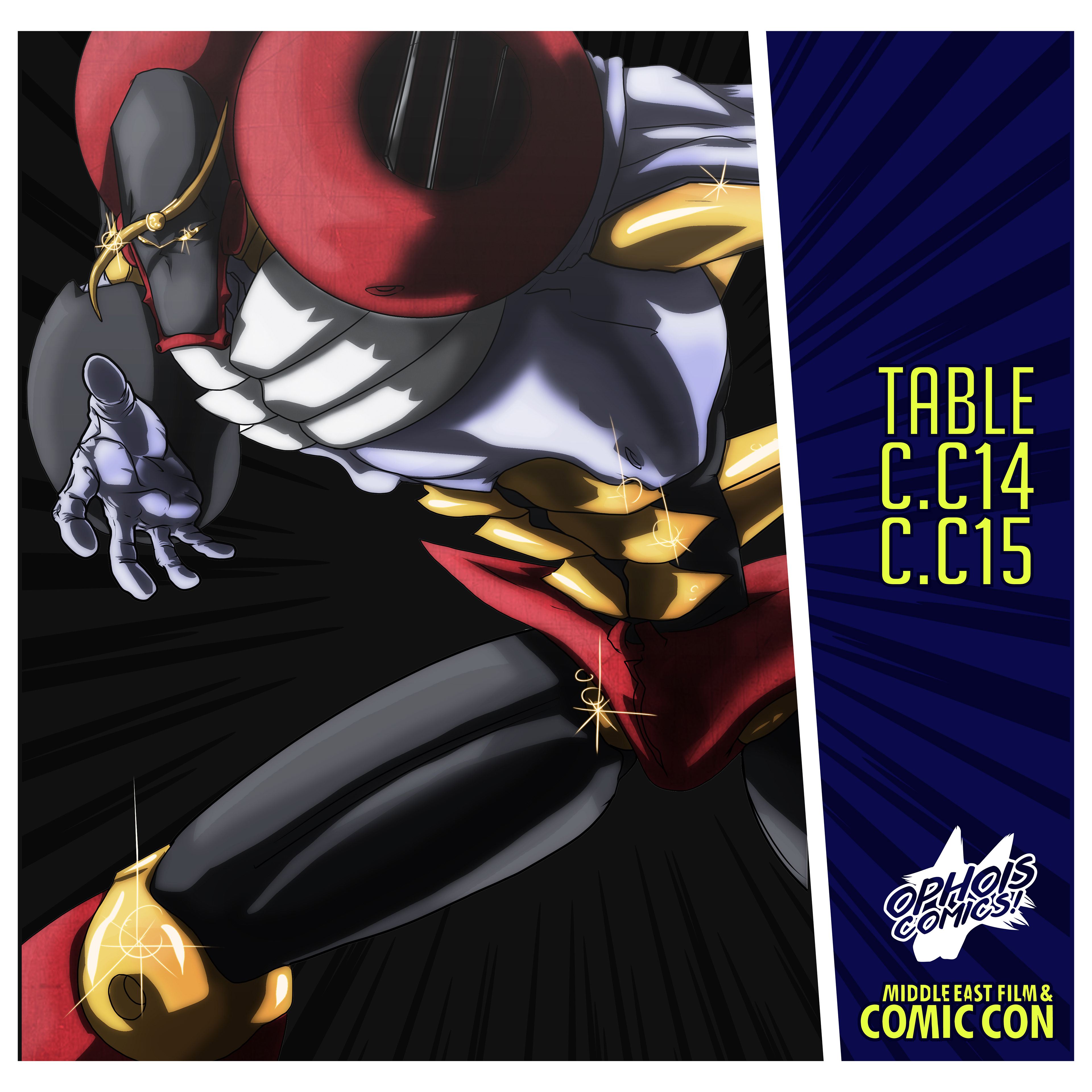
Social media posts:




Third: Ophois's main brand
Social media posts:


