Overview
Racemate began its journey at the 2021 Pyramids Half Marathon as a runner’s companion app. Runners entered their data, set pacing strategies, and received live audio guidance, with instant results waiting at the finish line. It was a successful launch that helped push our project for future development. Over time, Racemate expanded beyond a single race, adding features like advanced pacing options, interactive challenges, and community-led runs. Today, Racemate is crafted to offer athletes a complete running experience, guiding them at every step of their journey—a vision captured in its slogan change from "Your Race Companion" to "Your Running Companion".
Project time frame: November 2021 - Ongoing
Why Racemate
Racemate addresses a gap in sports technology by providing a personalized running experience that adapts to individual needs. It combines race preparation, live audio coaching, post-run analytics, and community challenges to support runners throughout their training and racing journey.
Unlike platforms that focus solely on tracking metrics and offering static training plans, Racemate offers dynamic goal-setting tools tailored for each race and run. These tools adjust to a runner's preferences, guiding them through each stage of their individual runs. The app also enables users to connect through community-led runs and challenges, adding a social component that can enhance motivation.
For race organizers, Racemate provides tools to simplify race management, including ticketing and leaderboards, aiming to improve the overall racing experience for both participants and organizers.
Contributors
I have been a core contributor to Racemate since its inception, with primary responsibilities in brand, UX/UI, and feature design. Early on, I led the branding design efforts, shaping Racemate’s identity to resonate with runners and organizers alike. At a later stage, I rejoined the project to focus on product design to build and enhance the user experience and functionality.
Other main contributors to Racemate’s design include:
Some junior contributors also joined our team briefly and added to the product in their short time with us. Each past and current member of our team breathed life into the project and added to what it is today.
Target Audience
We mainly focus on beginner to mid-level runners who need help with their running training. We also offer useful features for high-level athletes who participate in long marathons and can find our audio guidance feature useful.
The Story
I’ve been part of the Racemate project for three years, occasionally stepping away to focus on external client projects but always returning to this core in-house project at Optomatica. Racemate has impacted me both personally and professionally; designing an app for sports has been an incredibly challenging journey, especially in a small team where each member takes on multiple roles. Working on this project required me to engage with sports on a deeper level, giving me a solid foundation in running concepts and terminology, like heart rate training, interval training, pace zones, ground contact time (GCT), cadence, impact, and vertical oscillation (VO)
Sports tech is one of Optomatica’s strengths. Our team previously developed Racefox, a Swedish platform offering advanced solutions for running and skiing training, before it was sold. This strong culture of sports engagement within the team inspired me to take on my own 5K and 10K races and dive deeper into fitness training and swimming. These experiences, alongside working with teammates who were athletes, gave me firsthand insight into the needs of athletes and connected me more directly with the world we were designing for. It helped make Racemate's development more organic and always evolving.
1. Challenges
Developing Racemate is no walk in the park. The problems we face aren’t just unique to the project’s nature—they’re often compounded by the challenges of navigating the Egyptian sports tech market, handling tight timelines due to budget constraints, and the need to be event-ready on short notice.
One of our biggest hurdles has been maintaining an organized design system and file structure in a fast-paced environment. Constant feature additions demand regular app flow restructuring to keep everything clean and intuitive as we scale, which wasn’t anticipated in the original design at the beginning of the project. Each new feature introduces another layer of complexity, and with designers frequently pulled into different projects, time for maintenance and review is scarce. Staying on top of this has meant re-evaluating flows often to make sure they’re cohesive and don’t create usability issues down the line.
On top of that, every feature has to be double-tested. Given Racemate’s real-time functionality, features must perform as expected in live scenarios. This has led to last-minute design adjustments to accommodate tech limitations or resolve unexpected functional issues. Designing for such a dynamic app is genuinely rewarding, but the last-minute changes, technical constraints, and occasional instability can make it stressful.
Through these challenges, I’ve learned key lessons in organization and scalability. Setting clear guidelines for file design and organization has proven invaluable, especially when multiple designers work on the same file. Having a structured approach ensures that everyone can maintain the file as they go and facilitates smoother communication with developers. I experimented with various ways to organize files and use comments to document and communicate feature details effectively. This approach allowed team members to follow my work even in my absence, reducing the time spent on rework and leaving little room for error.
The impact of this structured approach has reflected positively on other projects as well—both developers and designers I’ve worked with have consistently appreciated the tidiness and organization of my files. It’s been a rewarding experience to see how a bit of upfront planning can simplify collaboration, reduce misunderstandings, and keep the project moving efficiently and with agility.
2. Racemate Mobile App
While I wasn’t part of the original team that kick-started the app design in 2021, I joined in mid-2022 to support improvements and expansion. Working under tight deadlines, I saw opportunities to enhance the app’s design and restructure our Figma files for accessibility and consistency. I led efforts to create a small design system, introduce design tokens, and streamline the Figma files with developer collaboration to ensure ease of use.
These changes began to show across the app, resulting in a more polished, accessible, and consistent design. I also worked on improving existing screens and flows for better readability and scalability. My involvement extended to developing new features in collaboration with management and marketing. With them, I designed features like challenges, Racemate Plus (our premium membership), heart rate tracking, audio controls, and community runs, along with other unreleased features like gamification, run design, and training plans.
3. Racemate Web Portals
Racemate isn’t just a running app; it’s a platform that also supports race organizing. In 2022, we launched a ticketing portal to allow users to buy tickets for challenges and partner races, which has been under development to be expanded into a more comprehensive set of management tools for organizers. I contributed to the initial version of the ticketing portal, helping to build a foundation that would support Racemate’s evolution as a full-service race organization platform.
4. The Brand
Branding isn’t always at the forefront of product design case studies, but I believe it’s deeply connected to product design itself, even when roles don’t overlap. Racemate’s branding has been integral to its identity and success and was the beginning of my journey with the project.
The logo features a running figure in the shape of a big "R" letter, inspired by Olympic pictograms, with no specific gender or race, to keep it universal and inclusive. It’s open to interpretation—some see the large “R” in motion or the running person or a blend of “R” and “M” for Racemate. This logo places the human athlete at the core of our vision, representing the running experience in an engaging, visually appealing way. The logo sets the tone for Racemate from the start, capturing its purpose while adding visual appeal. It’s even become popular on our merch, where team members and users alike enjoy wearing it.
Animation by Sara Taha
5. Racemate Merchandise
Our marketing approach largely involved participating in races as tech partners and participants. As the brand designer, I kicked off our merchandise line, creating t-shirts, caps, drawstring bags, key chains, and stickers. These items were worn by our team during races and distributed as gifts to users visiting our booths. It was rewarding to see people wearing our merch in places like Downtown Cairo and at events outside our direct involvement.
As my responsibilities shifted more towards product design, the task of managing the brand and designing new merchandise was taken over by our colleague, Sarah Taha.
Feature Development
In this section, I’ll outline the process of developing features for Racemate and share insights on some released features and future plans at the time of writing this case study.
The Process
Our feature development process is driven by direct user feedback, team insights, and competitive analysis, ensuring every addition resonates with the needs of our athletes. Once a feature suggestion is approved, I (or any assigned designer) collaborate with stakeholders—such as the product owner, project manager, and marketing—to align on objectives and set clear milestones.
From there, we kick off with a quick competitive analysis and prototype using our established design system. This approach speeds up alignment and provides other teams with a realistic preview, allowing us to refine the design iteratively. My role extends into implementation, where I work closely with developers to resolve any design or functionality constraints, ensuring each feature operates smoothly in real-world scenarios.
For instance, with Challenges and Racemate Plus (featuring heart rate tracking), two of the biggest released features I designed, I helped lead initial research, created a seamless user experience, and provided ongoing support during the build phase.
Notable Features
In this section, I’ll highlight three features from the features I directly contributed to in Racemate’s development: Challenges, Racemate Plus with Heart Rate Tracking, and Run design.
Racemate Plus and Heart Rate Tracking
One of the most frequent requests from our users has been to add biometric tracking to the app. Athletes rely on this data to push their training, monitor their progress, and expand their capabilities. Introducing biometric tracking was also a strategic step toward enhancing the user experience and laying the foundation for future features that customize training experiences.
Our competitive analysis included leading apps in the space, such as Strava, Map My Run by Under Armour, Garmin Connect, Adidas Run Club, Huawei Health, Polar, Pumatrac, RunKeeper, and Wahoo. Seeing an opportunity to stand out, we decided to leverage our existing tech from the company's previous work with Racefox. The product owner proposed offering our proprietary heart rate belts to select users, who would receive a promo code to unlock a new suite of heart rate–based features and the ability to record additional activities for one year.
I was responsible for integrating these new flows into the app, accommodating the heart rate tracking feature, and ensuring a seamless experience for users adopting the new belts.
In the near future, this feature will support additional heart rate sensors and be accessible to free users as well. While some of these sensors may not track beyond heart rate, we believe expanding this compatibility will attract a broader user base and allow participants using other services to join our races and challenges.
Challenges
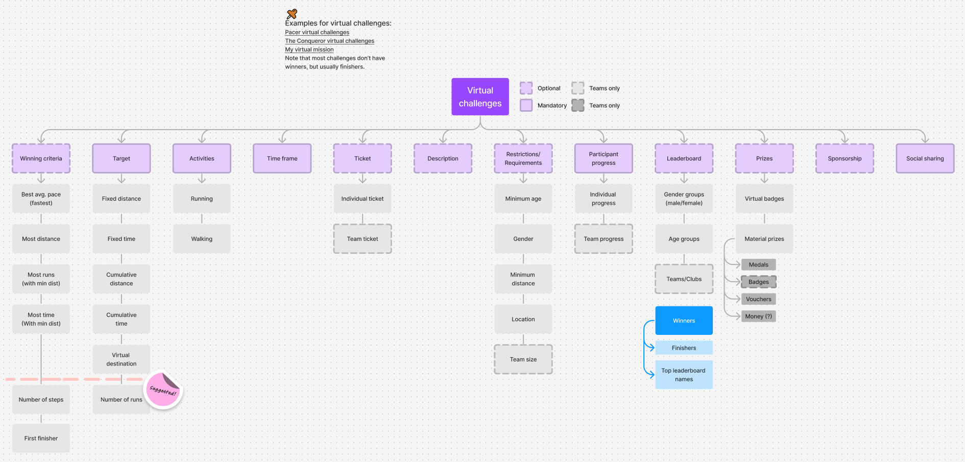
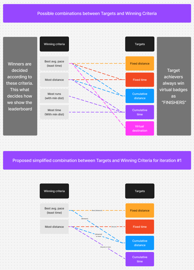
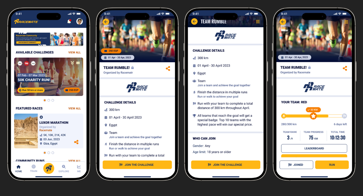
The Challenges feature was built for two main reasons: one is to bring users together through shared goals and a sense of community, and the other is to attract investors and introduce a new revenue stream to the app. Our user feedback and competitive analysis showed a strong interest in event-based objectives, where participants could work toward common achievements and compete along the way. To address this, we designed Challenges with flexibility—users can pursue diverse goals, like hitting specific distances or training hours, and engage in activities spanning multiple types. Challenges offer rewards like virtual badges, medals, merch, and promo codes. Challenges include live leaderboards, allowing participants to track each other's progress in real-time. This mix of competition and rewards keeps users motivated and fosters a strong sense of camaraderie.
Since its inception, the challenges feature has evolved a lot. Now, we have our main Runfinity monthly challenge and seasonal challenges (Summer, Winter, and Ramadan challenges). These challenges add to the original design, like milestones, interactive content, and levels, which Hoda Labib and Sarah Taha added later for each special event.


Design Your Run
* This feature has not been released, I will provide its Figma design files when requested.
* This feature has not been released, I will provide its Figma design files when requested.
Design Your Run allows users to create personalized running tracks with custom intervals for each training session. With options like tailored voice feedback and specific goals for each interval, it offers a highly customizable experience that advanced runners can shape to fit their needs. Designed runs can be saved and shared, enabling more experienced users to support others in their training journey.
This feature was inspired by real-world training sessions and competitive analysis, which highlighted a lack of flexible goal-setting and customization options in existing apps. Garmin stood out as a leader in this area, and user feedback showed that many advanced users wanted similar control over their sessions to match their coaches’ guidance. Design Your Run has been developed in response to this need and is set for future release.
Conclusion
Working on Racemate has been a rewarding journey that pushed me to explore the intersection of sports and digital experience design
Working on Racemate has been a fulfilling experience in balancing strategic design, collaboration, and adaptability within a fast-paced project. As a senior contributor, I led the development of key features, improved others as needed, and established foundational design standards to streamline our files and processes. Along the way, I navigated challenges in collaboration and resource alignment, helping to ensure that our design work remained cohesive and impactful for runners.
This journey has reinforced the importance of flexibility, strategic foresight, and maintaining a user-centered approach—all skills I look forward to applying in future projects. As Racemate continues to grow, I’m excited to see how these efforts will support its evolution and enhance the running community’s experience.
